
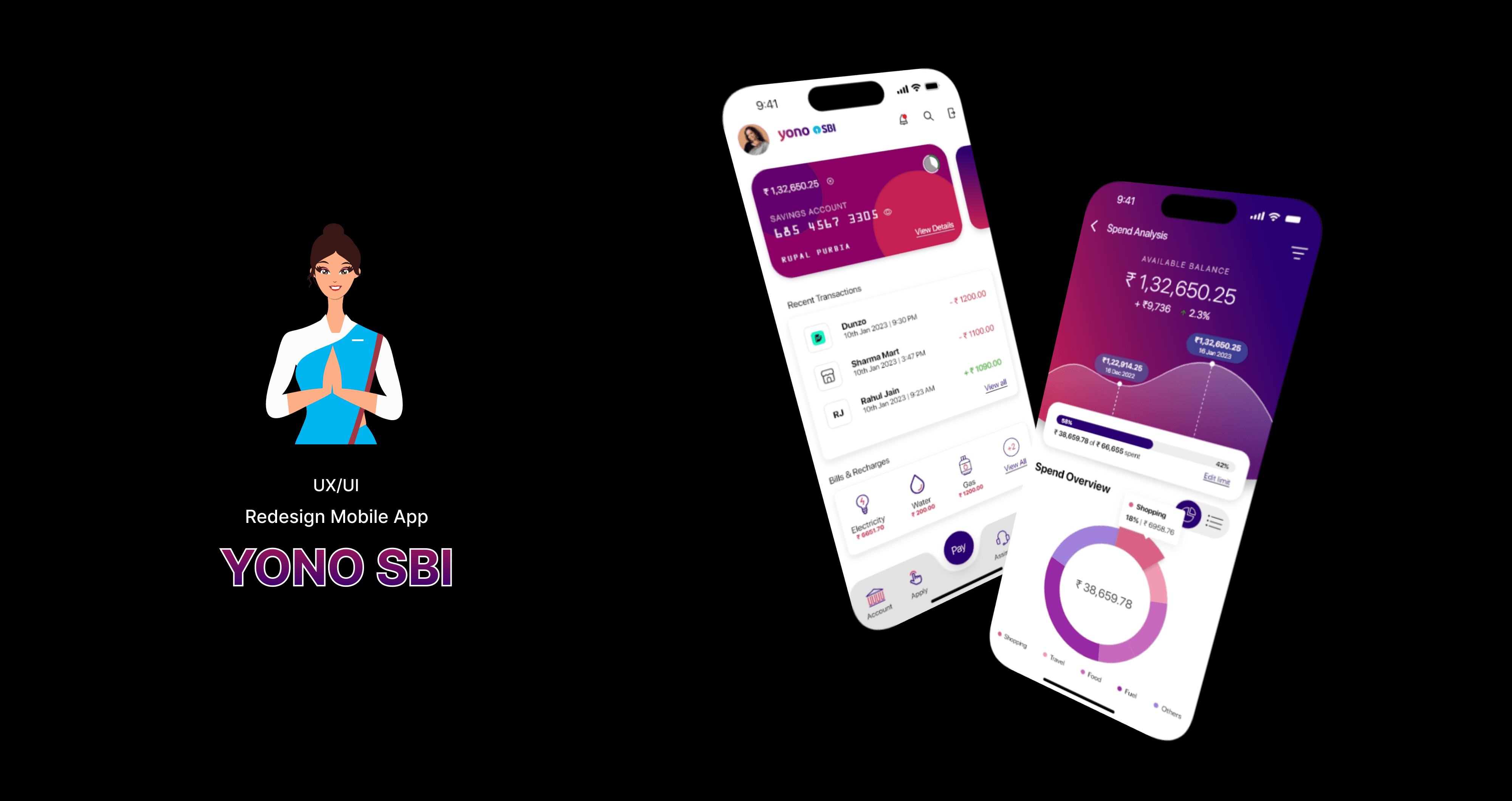
Banking App Redesign
YONO by SBI is a digital banking app used by millions in India, but many users face usability issues, outdated design patterns, and cluttered interfaces. This redesign project aims to improve usability, modernize the interface, and enhance the customer experience by focusing on intuitive navigation, visual clarity, accessibility, and actionable financial insights.
Proof of Concept
2023
Banking
UX/UI Designer
Challenge
Despite being a powerful financial tool, the YONO app suffers from dated visuals, inconsistent layouts, and poor user flows that frustrate both new and experienced users. The app needed a redesign to make digital banking easier, faster, and more insightful for all users.
Goal
1. Improving accessibility and clarity of financial tools
2. Simplifying navigation across banking, investment, and service sections
3. Enhancing user trust through visual consistency and modern UI
4. Delivering a seamless mobile banking experience for all age groups
5. Introducing Spend Analysis to help users track their financial behavior
Results
1. Delivered a modern, user-first redesign for one of India’s most-used apps
2. Simplified complex banking into intuitive, goal-driven workflows
3. Introduced smart financial tracking tools that promote self-awareness
4. Created scalable design patterns adaptable to other SBI services
Process
1. Competitive Analysis :
I evaluated leading Indian banking apps — Axis Bank, ICICI iMobile, Bank of Baroda (BOB World) — to identify strengths and gaps.
2. Heuristic Evaluation & User Feedback Review :
Identified existing pain points: navigation overload, outdated icons, unclear hierarchy.
3. Information Architecture Overhaul :
- Reorganized features into logical sections (Banking, Payments, Cards, Investments)
- Simplified menus and action flows
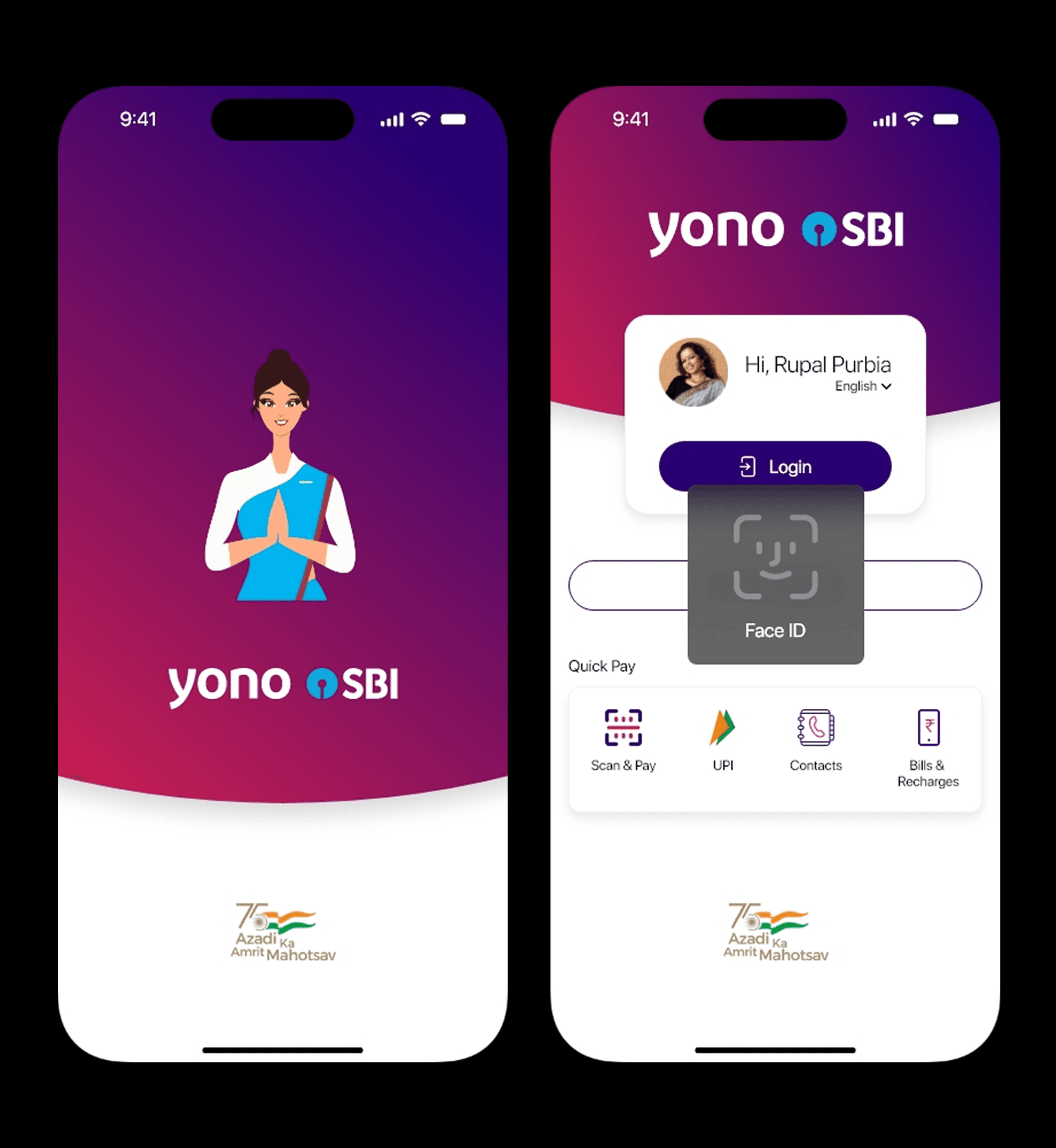
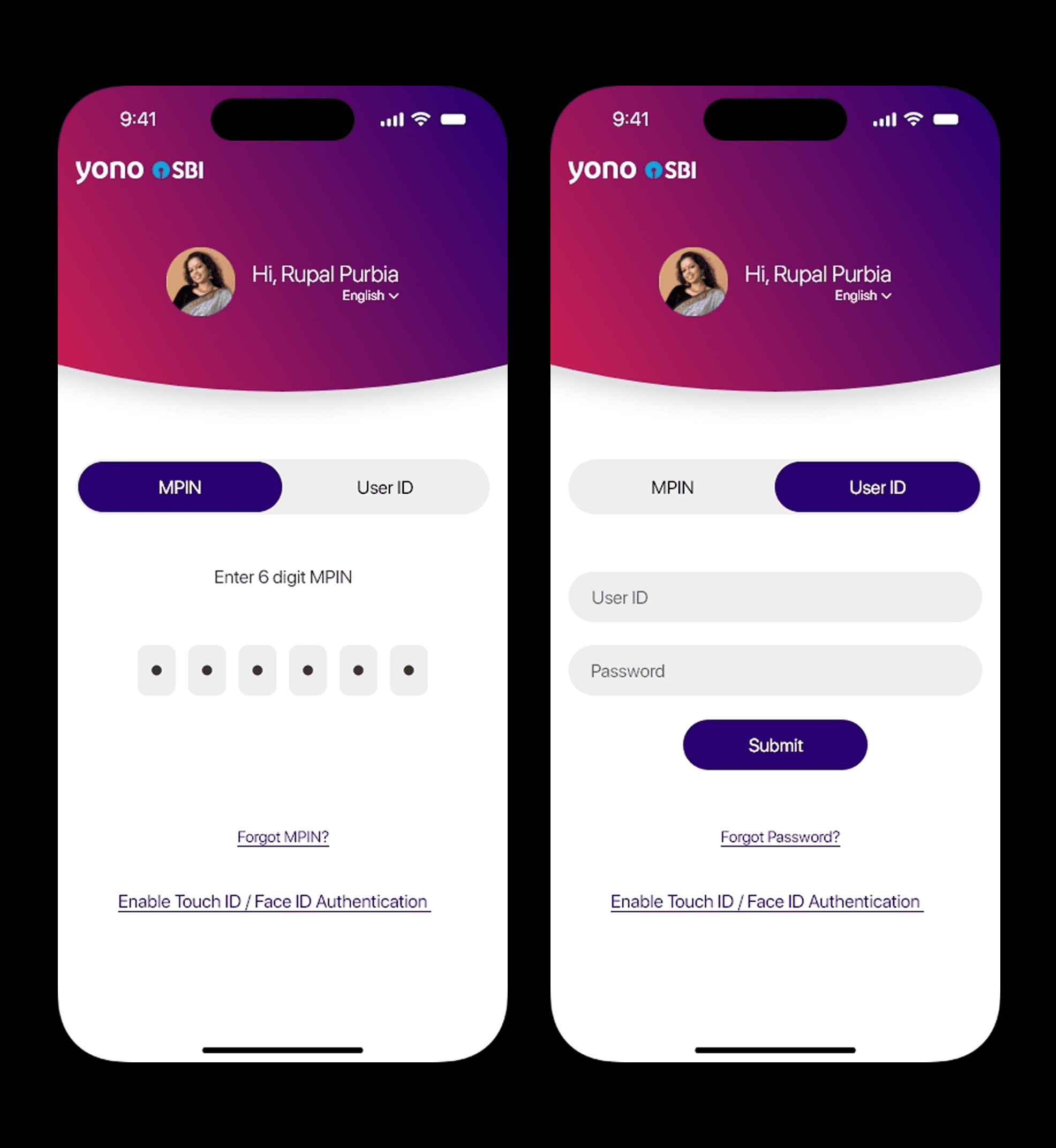
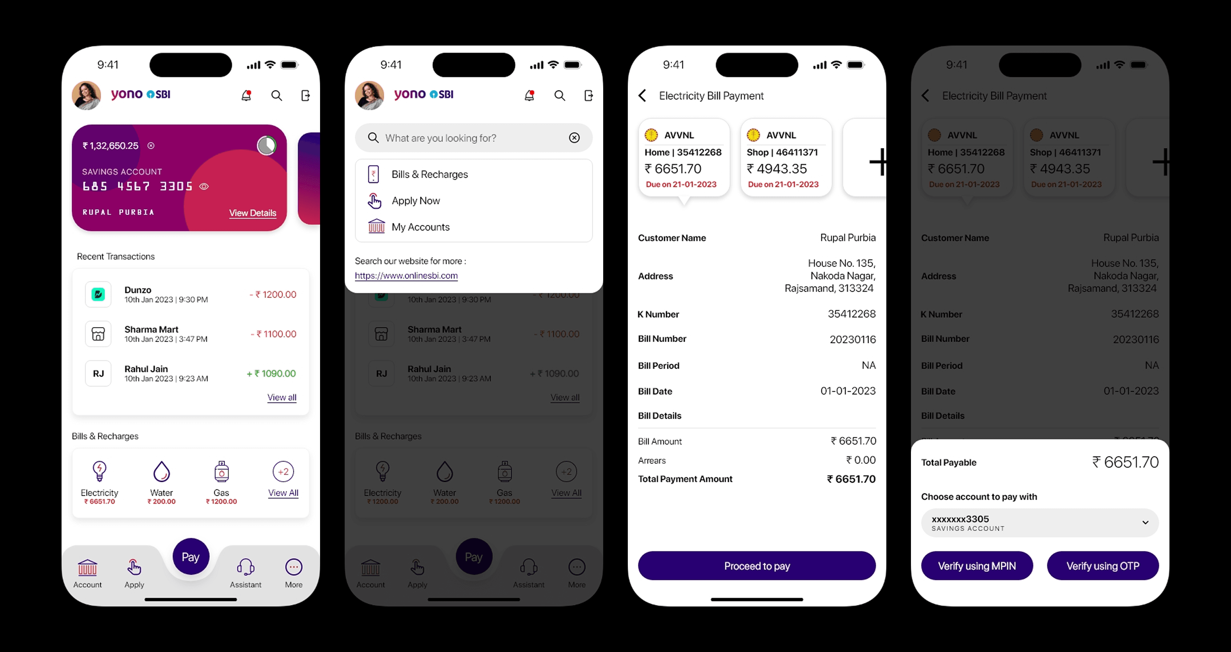
4. Wireframing :
- Focused on core use cases: UPI transfers, balance check, bill payments, and account summaries
- Reduced steps and improved visibility of key actions
5. Visual Redesign :
- Introduced a clean, modern color scheme aligned with SBI’s branding
- Enhanced readability, accessible icons, and structured card layouts


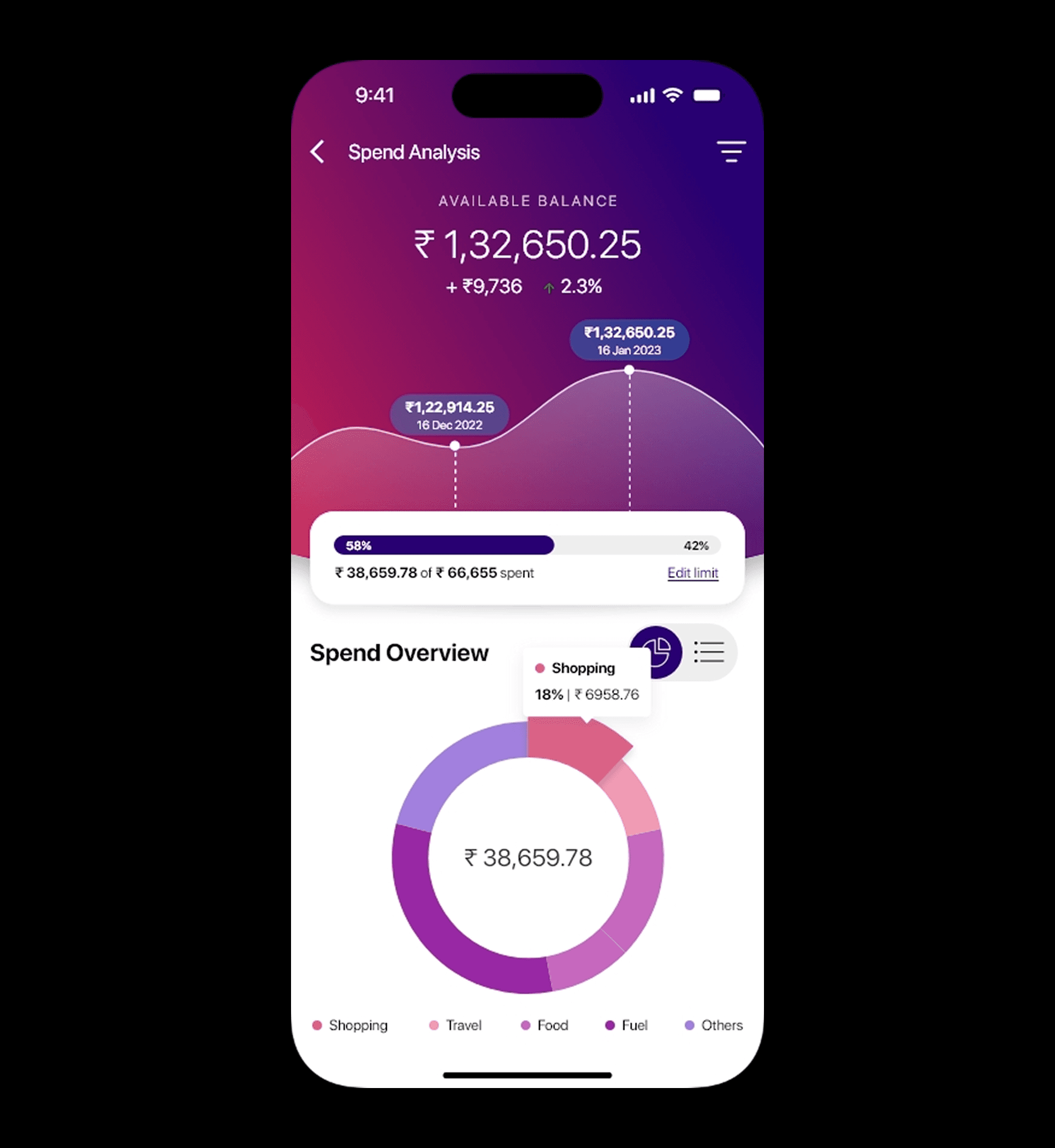
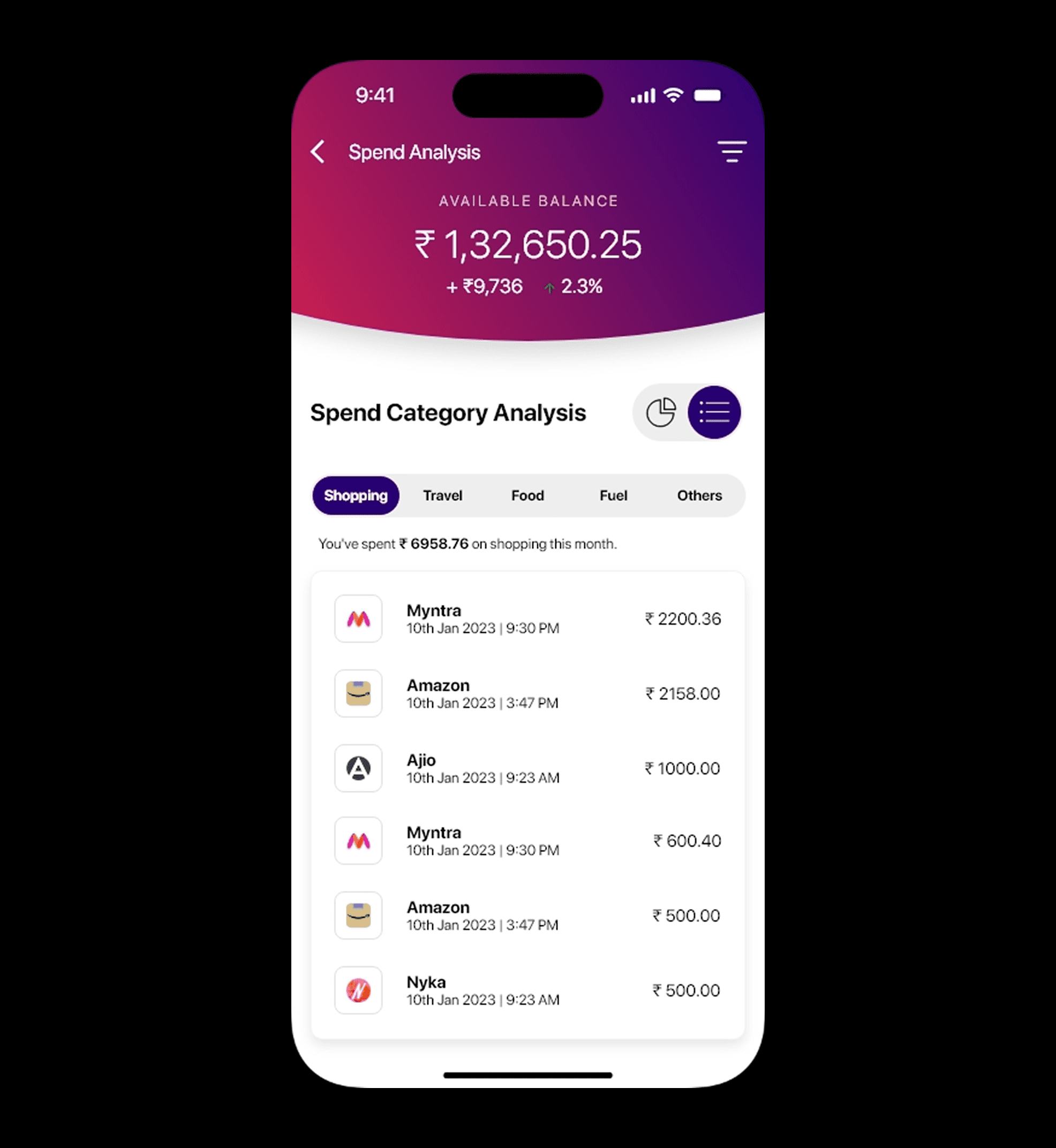
Highlighting Feature – Spend Analysis 📊
A brand-new Spend Analysis tab was introduced as a standout feature in this redesign. It helps users understand their spending patterns through:
1. Graphical Visualizations (e.g., pie charts & bar graphs)
2. Top Spending Categories auto-detected from transaction data (e.g., food, utilities, shopping)
3. Monthly Comparison View to track savings or excesses
4. Quick Insights like “You spent 18% more on Shopping this month”
This feature empowers users to take control of their finances — something missing from the original app.
Key Learnings
1. A competitive audit helps balance innovation with user expectations
2. Clarity in financial apps is not optional — it’s essential
3. Insight-driven features (like spend tracking) deepen user engagement
4. Elderly users benefit massively from visual simplification and big CTAs
