
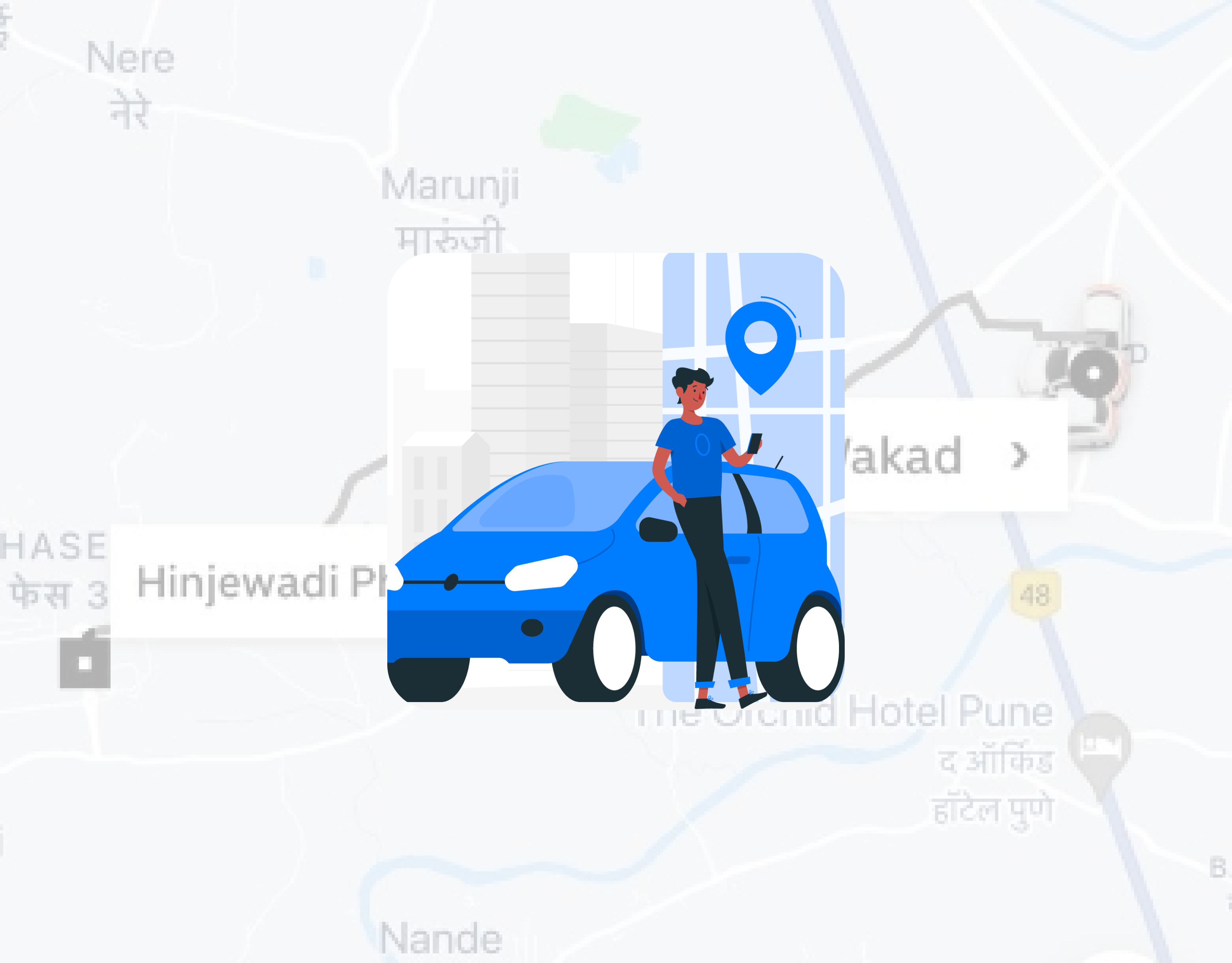
Optimizing Cab Driver Experience
This project presents a streamlined mobile interface tailored for cab drivers, enabling them to manage rides, navigate routes, and handle trip statuses efficiently. The focus was on simplicity, readability, and minimal distractions — all essential for on-road usage.
Proof of Concept
2021
Travel
UX/UI Designer
Challenge
Most driver apps are overloaded with unnecessary options or inconsistent layouts that increase cognitive load while driving. There’s a critical need for a clean, safe, and intuitive design that supports cab drivers in focusing on the road and handling essential ride operations.
Goal
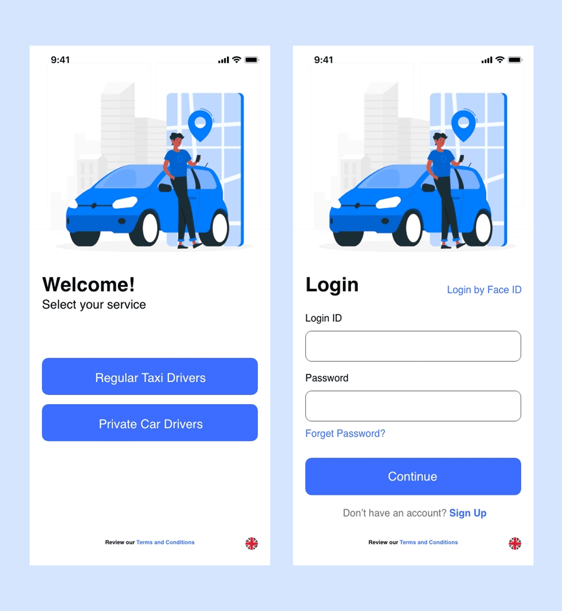
Design a mobile experience that enables cab drivers to:
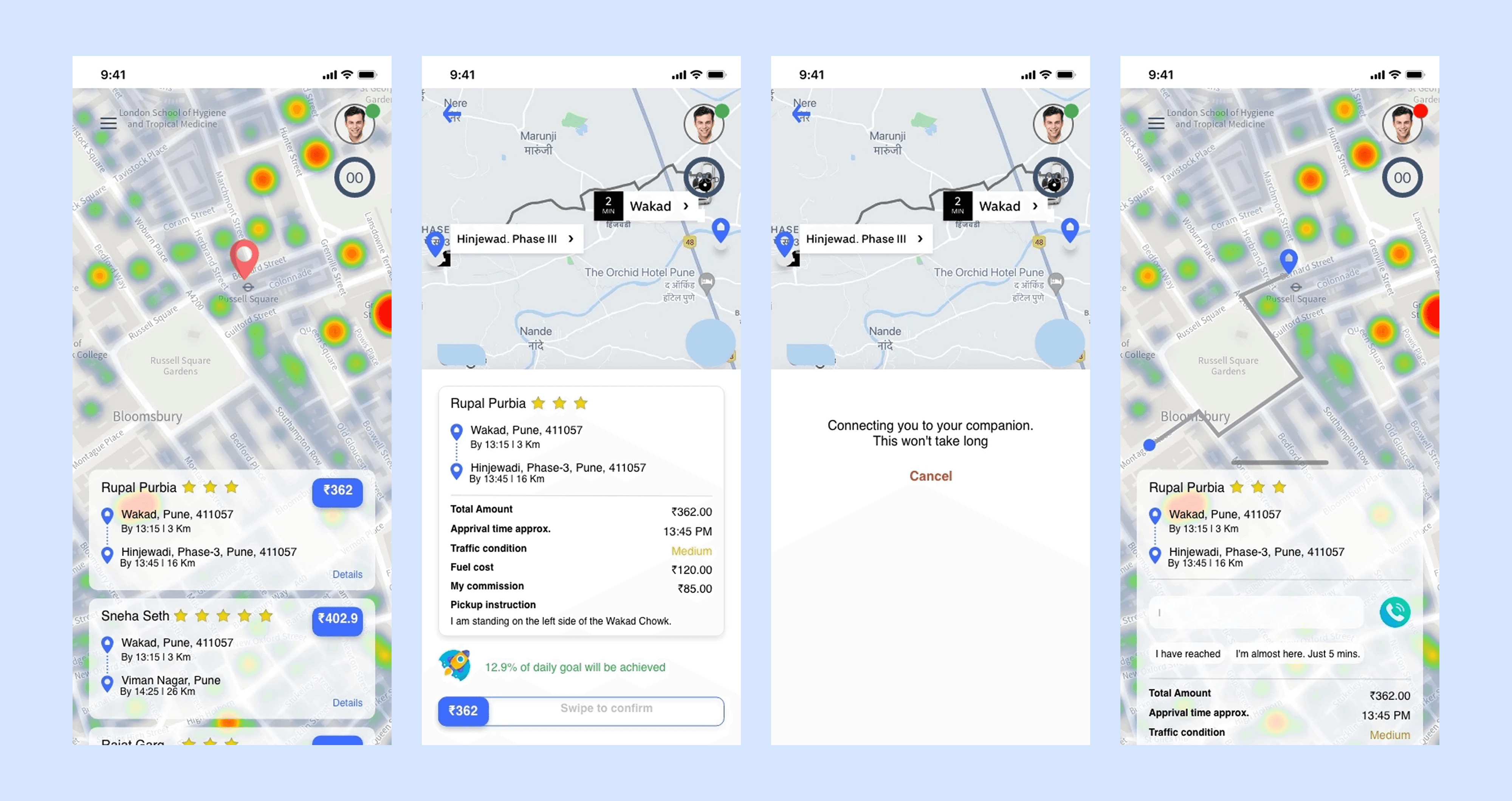
1. Accept or decline ride requests easily
2. View navigation and ride details clearly
3. Mark pickup/drop-off and complete rides with minimal effort
4. Stay updated with earnings and trip history.
Results
1. Built a driver-first interface that simplifies ride interactions, reduces distractions, and enhances productivity.
2. Prioritised UX elements that directly support on-road usage.
Process
1. Empathy Mapping & Pain Point Analysis :
- Studied existing driver-side apps (Uber Driver, Ola Partner, Bolt Driver)
- Identified driver needs: fast interaction, minimal screen clutter, focus on safety
2. User Flow Mapping :
- Ride notification → Accept → Navigation → Pickup → Drop → Summary
- Added Availability toggle and trip history overview
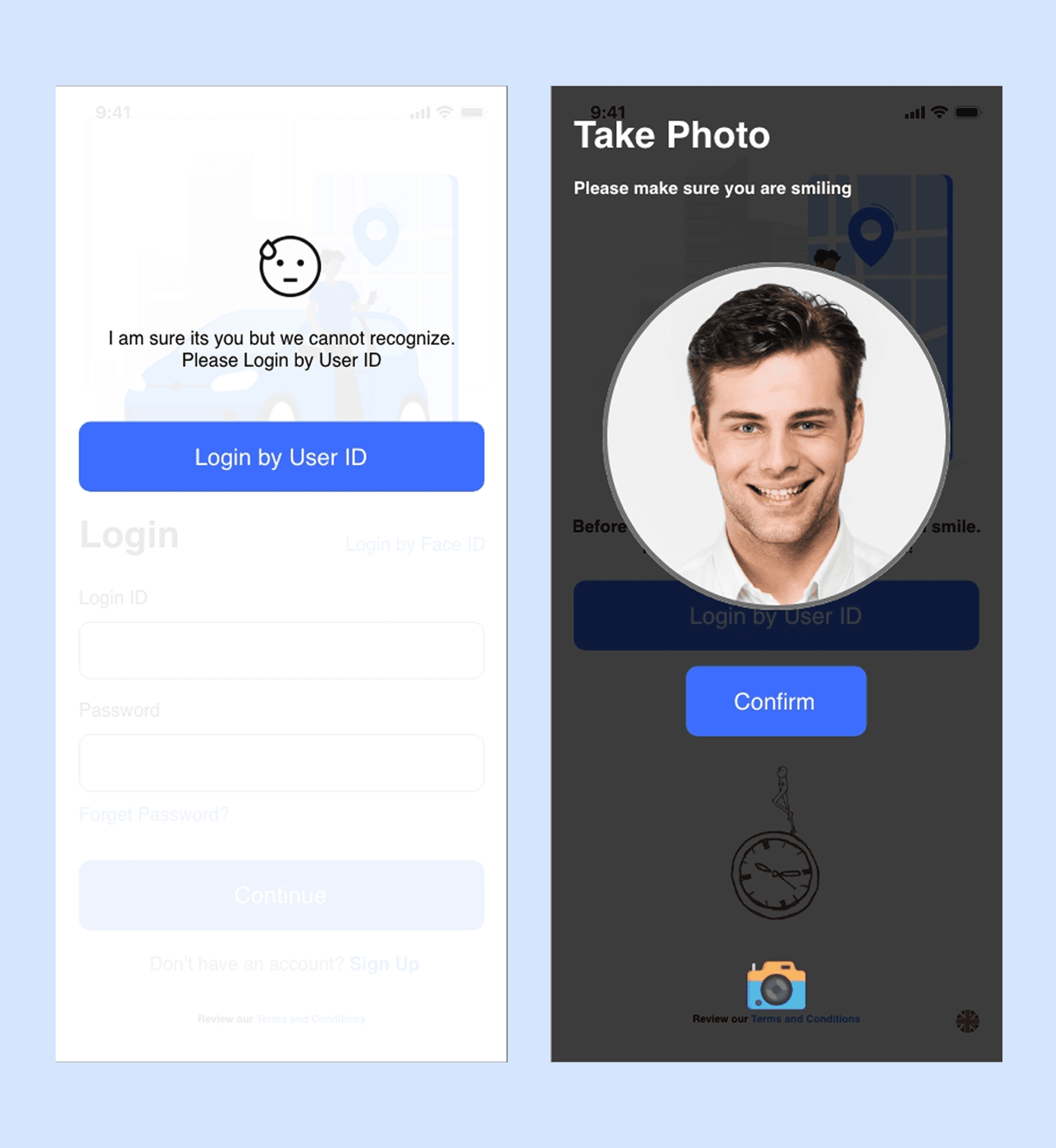
3. Wireframes :
- Focused on larger tap targets, voice-assist compatibility, and simplified flow.
4. Visual Design :
- Clean layout with strong contrast and readable fonts
- Used icons and card layouts for quick scanning
- Designed keeping one-hand usage and safety in mind


Key Learnings
1. Designing for drivers requires real-world empathy — every second counts
2. Interfaces should support, not distract — clarity wins over creativity in this domain
3. Visual hierarchy and tap placement play a crucial role in on-road usability
